
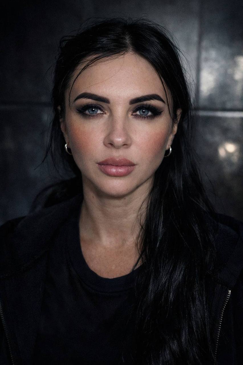
Yes, an AI visual can be created in the style of a specific brand. What’s more, AI lets you go beyond a single image that roughly matches the company’s colors — you can develop an entire series of visuals united by a shared style.
To do this, the brand itself is analyzed: its color palette, logo, the character of its photography, type of lighting, composition, fonts, materials, atmosphere, and the overall impression it wants to create with its audience.
What does it mean to create a visual in a brand’s style?
A brand’s style is much more than just using its brand colors.
For example, one brand might use dark backgrounds, contrasty lighting, metallic surfaces, and deep shadows. Another might use light backgrounds, soft natural light, minimalist compositions, and plenty of open space.
Even if two brands sell the exact same product, their visual content can look completely different.
That’s why, when creating an AI visual, it’s important to convey not just the product’s appearance, but the character of the brand itself.
What can you factor in when creating one?
Before generation, you can define the brand’s core visual characteristics:
- brand colors;
- type of lighting;
- contrast level;
- background character;
- materials and textures;
- composition style;
- product placement;
- atmosphere and mood;
- level of minimalism or detail;
- the tone of the advertising approach;
- the emotion the image should evoke.
As a result, AI isn’t just given the task of “create a nice photo” — it’s given a specific visual direction.